
Layout and writing
Make portfolio pages readable with clear headings, useful figures, and concise explanations.
Keep related text, pictures, and results together. A reader should be able to find a topic and understand the main point before reading every word.
Page structure
Give each page a clear subject, such as an change, programmer training, or a school partnership. Arrange the material around that subject.
A page could put the old and new designs beside a test table. An page might work better with a timeline and a project example. Keep fonts and margins consistent while giving each topic the layout it needs.
Choose the arrangement from the relationship you need to explain:
| Reader's task | Useful arrangement | example |
|---|---|---|
| Compare versions | Consistent rows, columns, views, and comparison points | Super 7, DECODE page 12 |
| Follow an action | A sequence or state diagram with labelled transitions | Blu Cru, DECODE page 15 |
| Understand learning over time | Stages with an example of work at each stage | Seattle Solvers, DECODE page 3 |
| Find the right detailed page | Short highlights and accurate page references | Rebel Robotics, INTO THE DEEP page 1 |
Read two layouts
Super 7 repeats the same visual structure for its intake, shooter, and turret revisions. A reader can scan one row across all versions before moving to another mechanism.
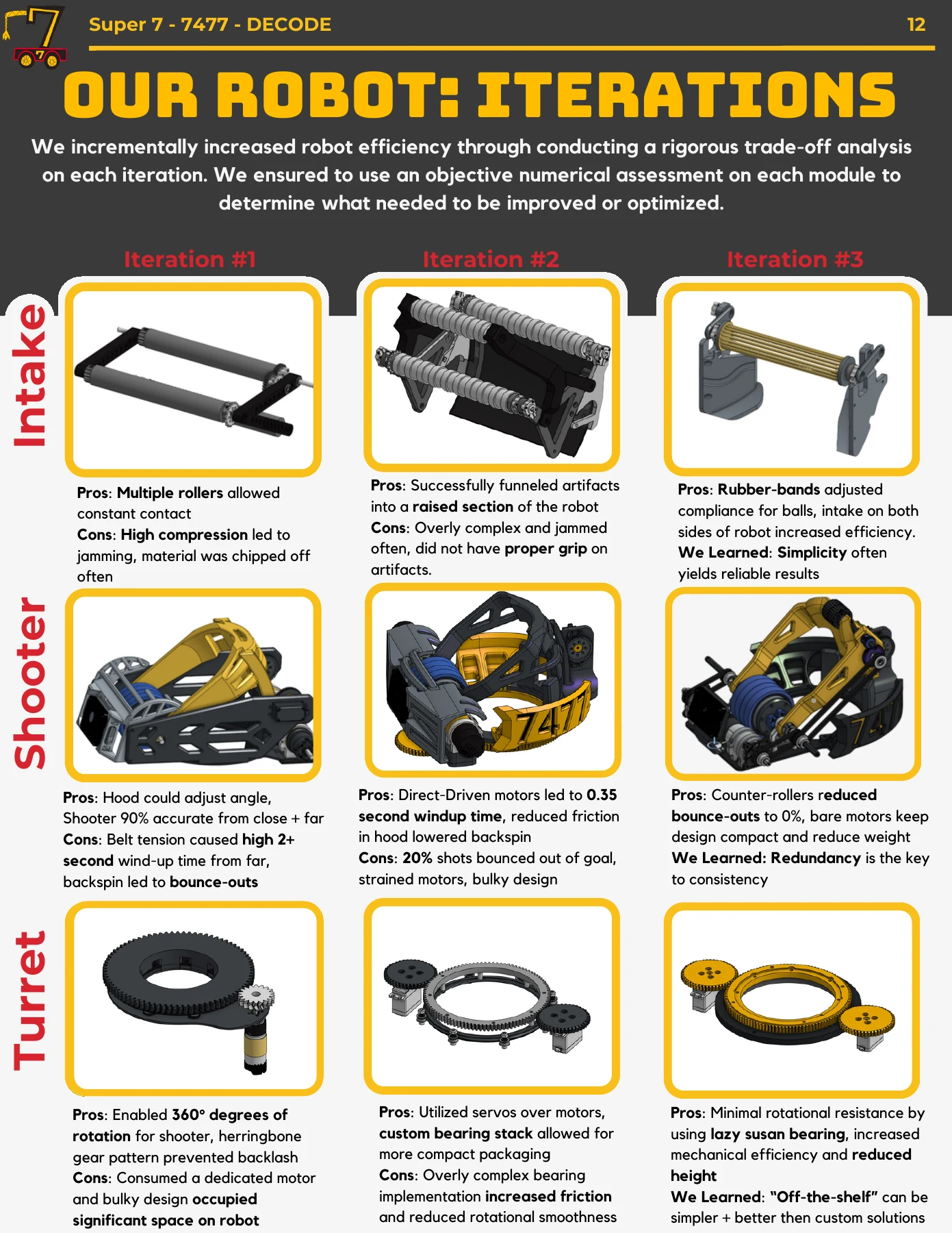
Borrow the alignment: put equivalent information in equivalent places. Give each image enough space to show the changed feature, and keep its observation beside it. The engineering guide explains how to write the comparison.
Rebel Robotics' opening content page separates team and robot introductions from award highlights and page references. Those regions have different jobs, and the headings make them easy to locate.
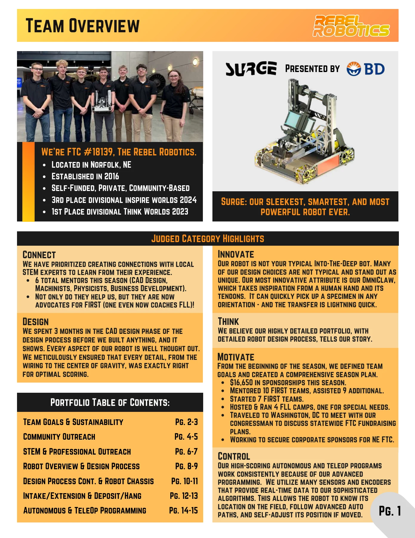
Borrow the hierarchy: an opening summary should help readers choose where to look next. Verify the references after changing the page order. Follow your event's judging guidance when deciding whether to use a category-highlight or contents format, and keep judged explanations on content pages rather than the cover.
Headings
Use short names such as Intake testing, Member training, , or results.
An opening overview can list achievements with page references. Put the longer explanation on the page it points to.
Explanations
Explain your team's decisions. If backspin mattered to your launcher, describe what you saw, what you changed, and how you tested it. Include enough physics to make the choice understandable.
Compare a vague statement with an explanation of the intake revisions on Super 7's page 12:
We made our intake better and more reliable.
Super 7 describes jamming and material damage in an early intake. Its comparison follows later roller arrangements and explains how the team changed compliance and simplified the mechanism.
The second version gives the reader a problem, a change to inspect, and the reason for that change. In your own portfolio, name the physical feature and the observation from your records. Add measurements only when you have the test conditions and results to explain them.
Type and contrast
Use comfortable body text and check it on a printed page and in a PDF at normal zoom. advises against text smaller than 10 pt; that is a lower warning boundary, not a size to aim for.
Save display fonts for short headings. Keep text off busy photographs, leave space between topics, and use colour consistently. Label chart lines so they still make sense in grayscale.
Figures and charts
Label the part or change a picture explains. Use a close-up when the detail is hard to see in a full- photo.
Give charts units and test conditions. Say how many attempts you ran, and mark goals separately from measured results. Crop screenshots to the useful area while keeping enough context to understand them.
Write a caption that helps someone read the figure: identify the version, point out the relevant change or comparison, and state the conclusion the record supports. For a graph, say what the axes and traces represent and what task was tested. Keep the caption beside the figure, including in the exported PDF.
Check reading order by hiding the small text briefly. Can a reader find the problem, the main figure, and the conclusion from the larger elements? Then read at normal size to check that the details are comfortable. Shrinking the body text to fit more material usually means the page needs editing.
Use artwork your team owns or has permission to publish, and credit outside work.
Tools
Canva, Figma, presentation , and document editors can all produce a portfolio. Choose something the team can edit together and export clearly at the correct page size.
Set shared styles for headings, body text, and labels. Draft the explanation before decorating the page, then check the exported PDF.
Sources and AI
Credit borrowed ideas, diagrams, research, and outside assistance in a footnote or endnote. This includes AI assistance, which FIRST permits with attribution and respect for others' work.
Check suggested text against your team's records. Every student should understand the claims about their work and be able to explain them.